Design System
Matte: the paint, parts and rules this site is built from.
A system drawn from 80s and 90s matte black electronics: powder-coated bodies, machined seams, printed legends and one warm accent. Every specimen here is drawn by the stylesheets the site ships, so this page always matches it. The bar at the foot of the window tunes the tokens and every part follows; the sun and moon button shows both finishes.
Try it in a lab → Settle it → Make it a token → Document it here
Colour
DraftMatte is one paint, lit from above. Every grey on a part is worked out from a single tone, --m-tone, so the body, the raised parts and the knurling stay in step when it changes. One warm accent, copper, marks what is live. The page around the parts uses the site’s roles (--ground, --fg, --muted), which say what a colour is for and change with the theme. Parts use roles and Matte tokens, never raw values.
Paint · Matte tokens as the page computes them now
Signal and status
The accent fills a part; the signal is the same colour used as a mark on a body, darkened in the light finish so it still reads. Status colours are for lamps and message text, and each is at least 4.5:1 on its body in both finishes.
Roles · values shown for the current theme
| Token | Use | Value |
|---|
The colours the site began with are kept under Legacy.
Type
DraftSöhne from Klim, in three cuts: Söhne Breit semibold for display, Söhne book for text, Söhne Mono for legends, tags, captions and metadata. Geist appears only as the split-flap board’s letters, drawn on canvas. Every size is a --text-* token. Text styles are shown here in the text colour; each page can set them in --muted instead.
Legends
On a Matte part, type is printed on the body, small and in capitals, or it glows from behind glass. Nothing else carries text.
.m-mark · .m-legend.m-display- Legend--m-text-legend · 10px
- Large legend--m-text-legend-lg · 12px
- Behind glass--m-text-glass · 9px
- Help and errors--m-text-help · 12px
- Small text--m-text-small · 13px
- Running text--m-text-body · 14px
--m-text-*Text styles
The site’s scale. Name, Section title, Project tagline, Lead and Body were set for the earlier cover and work page; they are still in the stylesheet, and no current page uses them.
--text-name
Breit 600 · 48–104px
line 0.95 · −0.03em
Brian Studwell
--text-section-title
Breit 600 · 36–68px
line 1.1 · −0.01em
Recent Work
--text-tagline
Breit 600 · 36–64px
line 1.02 · −0.025em
Who says enterprise can’t be pretty?
--text-page-title
Breit 600 · 40–72px
line 1 · −0.03em
Experiments
--text-heading
Breit 600 · 20px
Split-Flap Lab
--text-lead
Söhne 400 · 17–21px
line 1.5
I design human-in-the-loop agentic systems for high-stakes, regulated industries.
--text-lg
Söhne 400 · 18px
line 1.6 · max 46ch
Experiments, sketches, and things I built to see what would happen.
--text-base
Söhne 400 · 17px
line 1.6 · max 56ch
Enterprises shouldn’t have to use slow, ugly, awkward software to meet their compliance obligations and stay safe.
--text-sm
Söhne 400 · 15px
line 1.5
A wall of flaps that clatter round to spell a name.
--text-2xs
Söhne Mono 400 · 13px
Surface
SettledA part sits at one of four heights: a well cut into the body, the body itself, a key standing on it and a knob standing proud of that. Highlights sit on upper edges and shadows fall down. The paint has a fine speckle, --m-speckle, and in a plain key that speckle is iron: it stands up to the pointer and is thrown back by a press (see the Key under Controls).
.m-well · .m-panel · .m-key · .m-knobStates
SettledEvery control has the same states, shown the same way. Hover lifts the legend and the light on a raised part. Focus is one ring that appears at once. Disabled dims the part and it takes no input.
Motion
DraftShort and quiet. Seven durations and five curves, kept in the site’s stylesheet and used by every part here. Duration steps up with distance. Parts go down fast and come up slower; things leave one step faster than they arrive; only parts with a physical stop overshoot. With reduced motion on, travel becomes an instant change and light still fades. Smooth scrolling only runs when the visitor hasn’t asked for reduced motion.
--dur-1 to --dur-6, all on --ease-outall at --dur-6On the site · timings that sit outside the scale, tuned with their parts
- Hover colour, menus, nav buttons--chip-speed · 150ms
- Card lift--dur-3 · 160ms
- Reel play overlay fading out250ms
- Static spark flinch280ms
- Card thumbnail zoom400ms
Space, shape and layers
DraftEvery padding, margin, gap and corner uses one of these tokens. A Matte cell is padded 16 by 24 with 12 between its parts; the compact density is 12 by 16 with 8. The page column is 76rem wide with gutters of 4% of the window, never less than --space-4.
--m-pad-y · --m-pad-x · --m-gap.m-panel--compact- Tooltip--m-layer-tip · 1100
- Toast--m-layer-toast · 1000
- Dialog, drawer, menubrowser top layer
- Sticky bar--m-layer-sticky · 10
- Knob, key, body, wellthe four heights
front to backCorner radius
Spacing scale
A few values sit outside the scale on purpose: the split-flap board’s gaps and plate padding, and the nav’s phone gaps, are tuned in their labs; the 6px between a nav button’s icon and label is part of the settled button; section padding that clears the halftone dots is worked out from the halftone’s reach; and phone screenshots take a phone’s own corner radius.
Controls
SettledEach one works: turn, slide and press them. Knobs also answer to the wheel and the arrow keys.
.m-knob · --sm · --lg.m-knob--metal.m-switch.m-rocker.m-push · --sm.m-key · [data-latch] · --accent.m-key · [data-plain] · filings.js.m-key--pad.m-fader.m-meter.m-meter--v.m-meter--dots.m-meter--stereo.m-meter--needle · --lamp.m-ledEntry
SettledText goes into a well cut in the body. Every input sits in a field, which gives it a legend and room for help or an error.
.m-field · .m-inputerror · read-only · disabledtextarea.m-input · .m-search.m-number · select.m-inputSelection
SettledChoosing one of a few, or switching several on. A bank is the hardware radio group: press one and the others pop up.
.m-bank.m-seg.m-knob[data-options].m-check.m-knob[data-step]Actions
SettledThe key in its ranks. A panel takes one primary key at most; quiet keys are for the least important action.
--primary · default · --quiet · --danger · disabled.m-key--lgRead the surface notes before changing the tone.
.m-linkNavigation and overlays
SettledAnything that opens does so from the control that opened it. Press the keys to open each one; hover or focus the last key for a tooltip.
Input and output levels for each channel.
Bass, mid and treble, with a loudness curve.
Which inputs feed which outputs.
.m-tabs.m-menu · .m-pop · .m-dialog · .m-drawer · .m-toast · [data-tip]Feedback
SettledThe system reports with light. A lamp carries the status, and the words say what happened and what to do. Each status colour is at least 4.5:1 against its body in both finishes.
.m-banner · .m-status--ok · --warn · --danger.m-note · .m-led--busyprogress.m-progress · .m-skeletonNo stations are stored yet. Scan the band to find what’s on air.
.m-emptyData
SettledContent that isn’t a control: labels, counts, modules of text, and rows ruled with the same seam that divides a panel.
.m-tag · --print · .m-badgeLate night
Loudness on, treble rolled off, output held under 60 dB.
.m-panel--col · .m-title · .m-prose- Radio 390.2
- Radio 493.5
- Jazz FM102.2
.m-list| Channel | Source | Gain | Peak |
|---|---|---|---|
| 1 | Turntable | +12.0 | −3.2 |
| 2 | Compact disc | 0.0 | −0.4 |
| 3 | Tuner | +4.5 | −8.1 |
.m-tableSite components
The parts above, as the site’s own pieces, and the pieces that are the site’s alone. Each one is tuned in a lab, which saves versions; the page runs the active one.
Nav button Settled
- A Matte key. Class
.chip, inside.nav. On wide screens the nav is a rail down the left with every button one width; on a phone the links fold into a Menu. - Every value is a
--chip-*token. The Button Lab tunes them and saves versions, andbuttons.jsapplies the active one. Active version: … - A colour that matches the palette is written as its token, so it follows palette changes. The Button Lab’s colour pickers offer the palette as swatches.
- States change brightness, not colour, so one rule works in both themes. Icons are Lucide outlines, sized to the label.
- A button that goes to a page on this site carries a lamp: dark at rest, copper on the current page. Buttons that leave the site or download a file have none, and neither do Controls or the light and dark switch.
- The speckle in its paint is iron (
filings.js): it stands up to the pointer and a press throws it back, on the button under the pointer only. The Button Lab’s Experiments bench tunes it and saves versions. Active version: …
| Token | Value now |
|---|
Controls menu Draft
The labs, in a small Matte body with printed legends. It opens with a 4px drop and a 150ms fade, and closes on Escape or an outside click.
Card Draft
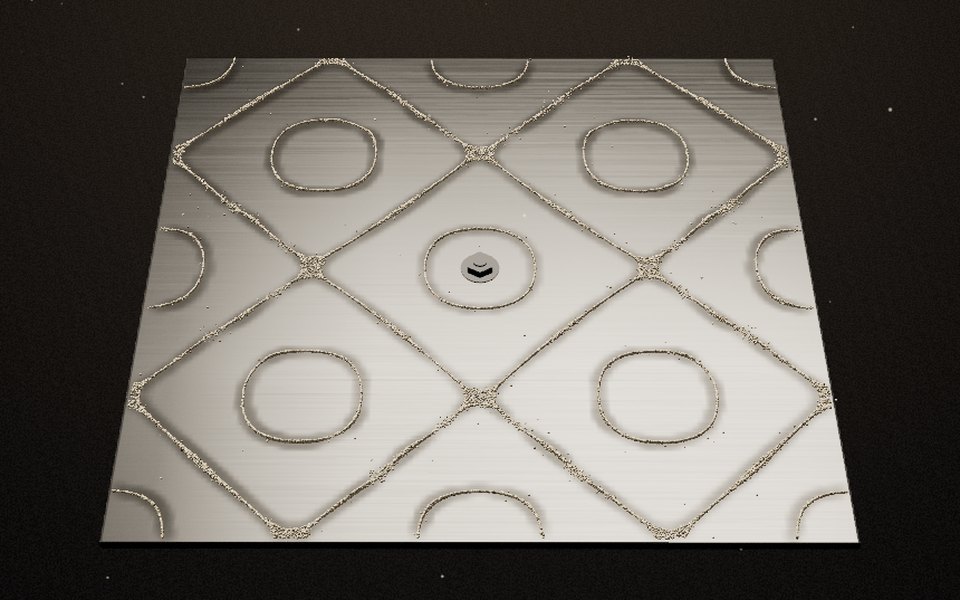
The Experiments wall. A Matte body, speckle and all, with the picture set into it like a screen in its well. On hover it lifts 2px and the thumbnail zooms slightly.
Split-flap board Settled
Design System
- One canvas per letter, each flipping round a drum of characters, drawn with motion blur so fast flaps smear like film. Letters are Geist; the plate and windows take their colours from the theme.
- Everything about it, from timing and blur to the plate and grain, is tuned in the Split-Flap Lab, which keeps a dark and a light version.
split-flap.jsruns the active ones. - On the work page it sits in a Matte housing and names the project on show, with a key for each project beside it.
- On phones the board drops its side columns, runs edge to edge and enlarges the letters. With reduced motion it shows the last frame straight away.
Halftone edge Draft
- One colour arrives in another through a halftone: dots of the new colour grow until they touch, then holes of the old colour shrink away. It spans the full width of the window. The footer of this page is one, from the page’s ground into Slate.
- Drawn by
halftone.json a canvas, with WebGL when it’s available, from the active version in the Halftone Lab. It may drift and respond to the cursor. It holds still for reduced motion. - Two of the earlier work sections, with the transition between them, are under Legacy.
Static spark Draft
- When the pointer comes close to a button, a small bolt jumps from the button’s edge to the pointer, and the button flinches brighter for 280ms. It never fires while the pointer is on the button, and only on devices with a fine pointer and without reduced motion.
- Reach, life, jaggedness, glow and colours are set in the Button Lab with the nav buttons. It is … in the active version.
Assemblies
SettledThe parts put together. The tuner is the control panel from the Chladni cover, rebuilt from the system; the channel strip is a second arrangement to check the parts hold up elsewhere.
the Chladni cover’s panelknobs, meter, fader, latching keysIn use on the site
- The cover: the Sound switch and tuning knob panel, the Recent Work key and the Covers menu. The panel is still its own drawing of these parts, not yet built from
matte.css. - The work page: the nav rail, the split-flap board’s housing and the key for each project.
- Experiments: every card is a Matte body with its picture in a well.
- The Dissolve Lab: a working tool built only from the parts above.
Rules
SettledHow to use the parts. These hold for every assembly.
Accessibility
- Text on a body is at least 4.5:1 against it. Lamps, value rings and the focus ring are at least 3:1. The tokens meet this in both finishes.
- Every control works from the keyboard. Tab reaches it; Space or Enter works keys and switches; arrows move knobs, banks, segmented controls and tabs.
- A lamp never carries meaning alone. Pair it with words.
- The speckle in a plain key’s paint is iron: it stands up to the pointer and is thrown back by a press. It is decoration under the legend, never the only sign of anything, and it is switched off for reduced motion. Coloured, quiet, pad and disabled keys have none;
data-plainturns it off on one key. - A control with no visible text needs an
aria-label. - Targets are at least 24px. The tick box is 18px, so always wrap it in its label.
- The focus ring appears at once and is never animated.
Content
- A legend is one or two words with no punctuation. Write it in sentence case; the stylesheet sets the capitals.
- A key says what it does: a verb, or a verb and a noun. “Save preset”, not “OK”.
- Units follow the value in a dim legend: Hz, dB.
- Numbers on a display use tabular figures and a true minus sign.
- An error says what is wrong and what to do about it.
- Running text is sentence case in the text face. Never set a sentence in capitals.
Layout
- A body is a row of cells divided by seams. One job per cell.
- The legend sits above its control; a state lamp sits below or beside it.
- One primary key and one accent-filled part per body.
- A body on the bench casts a shadow; a body inside a layout uses
.m-panel--flat. - Below 480px a body marked
.m-panel--reflowstacks its cells. Controls keep their size. - The light finish is a grey body, not a white one. Metal turns silver and meters show dark segments in a pale window; display glass stays black.
Icons
- Lucide, the set the site already uses, at 12 or 16px with a 1.5 stroke, in the legend colour.
- An icon replaces a legend only for actions everyone knows: previous, next, search, close, play.
- An icon-only key needs an
aria-labeland a tooltip.
Naming
- The site owns the scales:
--space-*,--radius-*,--text-*,--dur-*,--ease-*, and raw colours as--c-*. - Matte tokens are roles, named
--m-*, that point at those scales. A part never uses a raw value. - Classes are
.m-part,.m-part__pieceand.m-part--variant. - State lives in ARIA attributes (
aria-pressed,aria-checked,aria-invalid), not in classes. The one exception is.is-onfor a lamp.
Legacy
LegacyWhat the site was built from before Matte, kept because it may have a use. All of it is still in styles.css and drawn live here. The tuner doesn’t reach it.
Palette
Raw colours, --c-*, a working set from Figma with more colours than the site kept. The pages are neutral now. Slate still carries the footer, with Paper and Mist for its text, and the page’s roles are still worked out from this set.
Section bands
On the earlier work page each project sat on its own colour, with its own set of roles. Rust and Navy are dark in both themes, Ochre and Sage are light, and the Pine section turns Slate in light mode. Halftone transitions ran between them in this order. The band classes are what the footer’s Slate field uses today.
Buttons
The Apricot button was the call to action under each project’s image. It keeps Night text and lightens on hover, in both themes. Replaced by the Matte key.
Tags
Mono labels in an outlined pill. They aren’t links, so they have no hover state. Replaced by the Matte tag.
Reel player
- A product reel in a 16:9 frame. On the earlier work page it broke out of the column to fill the window, capped so the whole frame fit below the nav. No current page shows a reel; the reels themselves still ship.
- Before it plays, a glass pill sits bottom left, clear of the title card, over a soft shade. On hover the pill fills with the text colour. Once playing, the overlay fades in 250ms; when the reel ends the label turns to “Replay”.
Project section and halftone transition
Two work sections as they appeared on the earlier work page, shortened. Each section’s colour arrives through a halftone.
Tagline that sells the work
A short description of the project in the body style. The text column stays narrow on the left; the image takes the rest of the width.
The next section
Every section sets its own roles, so text, lines and tags follow its colour.
- Layout: tagline, tags and description in a narrow left column (
minmax(340px, 5fr)), the image in the rest (9fr), stacked below 800px. The call to action tucks under the image’s right corner. - Height: on the earlier work page each section was at least a screen tall plus room for the transitions at both ends, so a full screen of solid colour sat between them.
Open issues
Known problems and undecided questions, to settle as each piece is.
- Matte’s legends are smaller than most systems allow
Printed legends are 10px and legends behind glass are 9px. Most systems keep working text at 11px or more. Either raise
--m-text-legendand--m-text-glass, or keep the size and accept it for short capitals only. - Capitals
Matte sets legends and keys in capitals. The phone cover’s plain controls had their capitals taken out as a preference. Decide whether that preference applies to Matte.
- The cover’s control panel isn’t built from the system
The Sound switch and tuning knob on the cover are their own drawing of a Matte panel. The Tuner under Assemblies is the same panel rebuilt from
matte.css; the cover should use it. Until then the cover attaches the iron filings to its own knob and switch by hand. - Spike length on small parts
The iron filings use one spike length for every part, so they stand tall on a small knob or a switch thumb. It could scale with the size of the face.
- Some nav button colours aren’t in the palette
The Matte version of the nav button carries its own greys (
#2e2e30,#1f1f21,#b4b4b6and the light finish’s) as plain values in the Button Lab. They match Matte’s tokens by eye, not by reference. Point them at--m-*tokens, or have the button take its colours frommatte.css. - The type scale has near neighbours
18, 17, 16 and 15px all appear. Intro (18) and body (17) could merge, and five of the text styles are no longer used by any page.